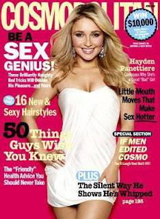
 This magazine is aimed at ages 16 to around 19-20. This magazine is very popular because it focuses on fashion, real life stories and sex love and relationship advice and lifestyle tips, This is the reason it has become so popular because fashion, sex and gossip is what younger girls find most interesting in society. Cosmopolitan is published in the U.K.
The thing that caught my eye on this magazine is the fluorescent bright pink background, i think that this contrasts well to the type of magazine that it is because Cosmopolitan is a magazine aimed at young women, and the colour pink is know to be very popular to girls and young women. Each week there is a certain celebrity starring as the main focus as the cover image. For example on this front cover there is a large image of Hayden Panettiere covering around 70% of the cover, this shows to the reader that she is going to be the main headline in the magazine this week, this will also attract attention to the magazine.Most of the writing is in white, the title if partially covered by the image of the celebrity, this is a sign of how popular the magazine is because the publishers no longer feel the need to show the whole title because they can assume that even thought some of the title is covered, the magazine is known well enough for the public to know what magazine it is. Some of the writing is in black, this is because the publisher wants to emphasize that certain headline for example 'little mouth moves that make sex hotter' the reason that this is in black is to emphasize to the potential buyer that they can get sex advice from this magazine, and because this magazine is set to focus on relationships and sex, this will definitely attract the reader to buy this magazine. Another headline that is in black is 'the silent way he shows he's whipped' this is very tactful, because not only has the publisher highlighted this story line, but also not included a name, this will immediately make the reader want to read on to find out who.